Using the right colours in your print is vital to creating valuable marketing materials that connect with your audience and work to build a connection. Colours convey different emotional responses such as blue which signifies trust and dependence whereas an orange may suggest a cheerful and friendly outlook.
We all perceive colour in different ways and it can therefore be seen as a subjective topic especially when we apply colours or inks to different materials via digital printers. Print is a vast industry, and all the machines are designed to print across a range of different medias using specialised ink sets. These can be water based, UV curable, solvent and many more, but the application of these inks is specific to a media group for example textiles or hard signs like you see on the side of our roads.
In this guide we will provide an overview of the critical differences between ink types used specifically by HFC and then also explain how a file should be provided in the correct colour space to try to ensure a predictable outcome is achieved once the image is printed.
Ink types and printing processes
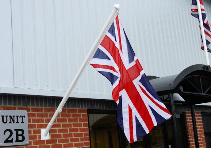
HFC use four different types of inks to produce graphics across a range of media. The first is Disperse Dyes. These high-quality inks are used in direct to textile printing and if you order a textile product from us it is highly likely that this will be printed using these water-based dyes. These are considered to be very good for the environment and have a high UV rating meaning they stand up well to the sunlight.
They produce a vivid colour allowing exceptional penetration of the dye to the reverse side of the product. This process is historically used for flag production where it is imperative to achieve strong colours on both sides of a thin polyester.
HFC also print indirectly using a well-known method called dye sublimation. We firstly print to a paper substrate which simply acts as the transport for the image to be applied to a textile of your choosing. This occurs by heating the paper print through a series of rollers on a machine called a calendar. This turns the ink on the paper back into a gas and then this gas fixes itself onto your selected textile during the heating.
This is a cheaper method of production, and the inks have a lower UV rating than the direct inks described above. However for most exhibitions, short term use & internal events this type of print is ideal and is probably the most popular method for textile print currently in the UK. The big benefit of this method of production is the ability to transfer your print onto unstable or stretch medias that a direct printer would not tolerate.
As well as textile printing, HFC have specialised for years in latex ink printing. This is a high performance, gold standard ink type that is water based and comes with high green credentials. It is incredibly versatile and can be applied to a vast array of medias from backlit textiles to wallpaper, vinyls and banner substrates. Using a Thermal print head the ink is applied to the media and then the latex particle within the ink is cured during the post print heating process and this provides a smooth result with incredible detail. If you order a banner or vinyl sign from us you can be guaranteed the latex ink set will provide you with unmatchable quality.
Finally, and most recently the team at HFC have invested in machinery that enables us to print direct to a range of soft and rigid boards up to 50mm in thickness. This is possible with the dawn of the UV ink set that is cured during the printing process with UV LED light. This again is a very versatile style of print which with the addition of the white and clear ink on top of the standard Cyan, Magenta, Yellow & Black provide multiple options for printing on various media. It gives us the ability to create fine art effects and transitions. It’s only really limited by your imagination.
Understanding colour models or colour spaces
Colour is produced in several ways but is important to understand what is possible when we are creating artwork for a digital printer. When creating artwork you have many options available to you in terms of the colour space that set your artwork up within. Understanding the differences between the colour spaces is essential to ensure a predictable outcome is achieved.
The RGB Colour Model – Avoid for printed images
The RGB colour model is an additive colour model in which the red, green and blue primary colours of light are added together in various ways to reproduce a broad array of colours. The name of the model comes from the initials of the three additive primary colours, red, green, and blue.
The RGB colour model has a wider gamut or possibility of colours than the CMYK workspace that we will go onto to discuss next. The reason for this is because it is derived from light. When you look at your phone screen or laptop you will often see incredibly bright greens, electric blues, vivid purples and oranges.
The problem with this colour space is simply that is not designed in anyway for printed graphics because the digital printer is in most cases not able to reproduce such bright colours unless for example a printer has a specialised ink colour installed which in most cases is not true and should not be relied upon unless you understand where your print is coming from.
Although modern printers have inbuilt profiles that can render RGB images more accurately than in the past it is simply not a wise choice to provide your artwork in the RGB colour space as the printers software will simply convert your image to CMYK and make all those vivid colours into a dull version of their former selves.
Generally speaking the RGB colour space should be reserved for graphics that is to be viewed solely on a screen such websites or apps.
The CMYK Colour Model – Encouraged for printed images
The CMYK model uses subtractive colours. This is where the background starts of white (like a sheet of paper) and as more colour is added it gets darker until it turns black. CMYK refers to the four ink types used in colour printing: cyan, magenta, yellow, and key (black).
Ink printed to different medias reflect the lightsource towards your eye meaning that these are directly affected by the type of lighting conditions. For example the same colour can look different in daylight or within a building using fluorescent bulbs because the lighting colour effects how the colour on the print is perceived.
To add to the this the colour or level of opaqueness of the material that you print onto also effects the consistency of your colour and can have a huge impact on what you expect to see on the final print.
As discussed above the CMYK model is the smallest colour space but it also provides the best opportunity to ensure an accurate colour print is achieved to meet your expectations. This is because you are creating your artwork using the same colour combinations that the output printer has installed.
HFC always recommend creating your artwork in the CMYK colour space
The Pantone Matching System
The Pantone Matching System (PMS) is a colour standardization system that helps in colour identification and matching. It uses the Pantone numbering system to identify colours, and through this numbering system printer and other equipment manufacturers can match colours without having to contact one another.
What we must be aware of is that pure Pantone colours are made from a palette of 18 basic colours, each of the spot colours in the Pantone Matching System is mixed according to its own unique ink mixing formula developed by Pantone. What this means for our CMYK or 4 colour ink set is simply that not all Pantone colours can be achieved via this printing process because we are not printing with 18 different shades that can be mixed to make a much greater and more pure set of colours.
Pantone colours are useful to provide as they do make your expectations clear on what you want to achieve in your print, however in real terms it is only possible to accurately match 55% of the Pantone system through 4 colours. Normally we will inform you if we feel the colour you wish to produce is simply not achievable through our printing processes and will offer a sampling service so we can ensure your expectations are met prior to running your job.
If you want to understand more about the potential match of a pantone colour through a 4-colour printing process we recommend you obtain a Pantone Bridge chart that will visually illustrate what Pantone colours are within the gamut of the printers we use to output your designs.